
When the Org Chart Flattens, What Happens to Your Story?
Two things are happening to the middle of the org chart
Two things are happening to the middle of the org chart, and together they make it harder to prove your judgment at work.
The first is fewer layers. Statistics Canada's September labour force survey, released October 9, counted 68,000 fewer jobs than in August, and public sector employment fell for a fourth month in a row, down 70,000 in September alone. The reasons differ by employer. The effect on the chart is the same: fewer people standing between you and the people who decide what happens to you.
The second is not as obvious. The routine work that used to fill a status report, the files reviewed, the tickets closed, the milestones hit, is increasingly counted by tools, and in a few places already done by them. What's left for a person is the part a tool can't be handed: the call. Which option, which risk, which exception, when to say no.
Put the two together and you get a gap. The manager who watched you decide may not be there next quarter, and the dashboard that replaces the status report lists what you shipped, not why. That's the part you're being kept for.
A quick test before you read on. If a senior leader asked tomorrow what you decided last quarter, and why, who besides you could answer?
What a tool can see
Performance systems are starting to read what tools can read. HiBob surveyed 1,200 AI decision-makers in the United States, the United Kingdom, German-speaking Europe, the Nordics, the Benelux countries, and Australia and New Zealand. None of it is Canadian. It found that half of the organizations tie AI proficiency to performance ratings and two-thirds to promotions, and that only 36 percent of respondents call their managers highly prepared to upskill teams on AI.
Meta shows where that can lead. Its review tool, Checkpoint, pulls from the systems employees already use and summarizes each person's contributions, and managers read the summary before they set a rating. An HR leader told staff it's an "impact-evidence starter." Take the word "starter" literally. A tool can summarize what happened. It can't say what you chose not to do.
Meta's example starts with software engineers, and the HiBob numbers come from other countries, so read both as a direction rather than a forecast for your employer. The direction is plain enough: the more of the record a machine makes, the more the part only you can supply, the decision and its reason, has to come from you.
A tool can summarize what happened. It can't say what you chose not to do.
The witness leaves first
Look at what else leaves with a layer. For most of a career, your judgment has been proven by someone who saw it. A manager remembers the day you held a launch and turned out to be right. A director signs off on an exception because she has watched you make three good ones. None of that is written down. It lives in their heads, and in a reorganization their heads move before yours does.
The Bank of Canada's June staff paper is a useful counterweight to panic. Drawing on its December 2025 survey of business leaders, it found that adoption of AI for production purposes "remains limited," that firms expect limited effects on employment over the next year, and "modest net negative impacts on employment over the next 3 years." That reads as a slow turn, not a cliff.
Slow is the good news. It means there's time to build the record before anyone asks for it, and no reason to build it in a hurry.
Your best witness is usually the first to move.
The project tracker said green
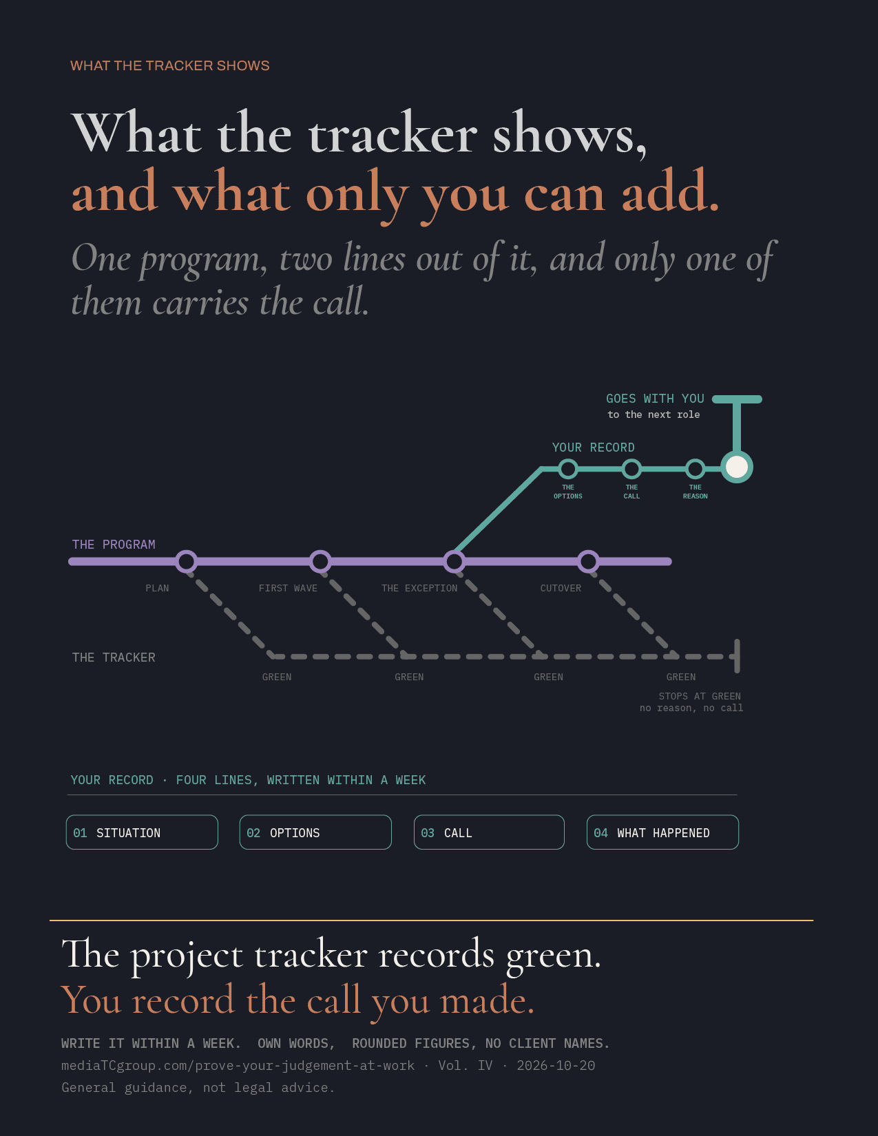
I've seen this from the inside. I once helped lead a large platform migration, with every move on a fixed cutover date. The tracker showed every move as green, amber or red.
What it couldn't show was why a move was green. Some were green because a problem the standard readiness sessions couldn't settle, a data discrepancy across products, a sequencing conflict, a complication in the middle of a wave, had been taken out of the script and into a direct conversation. I led those. I laid out the options and what each would cost and risk against a date that couldn't move.
The tracker recorded the green. It didn't record the call. Had I left that program the week it ended, a reviewer reading the file would have seen a manager who kept a schedule. The part that mattered lived in my head, and in the memory of the people in the room.
The tracker recorded the green. It didn't record the call.
Four lines, written the same week
A decision record is four lines, written within a week of the decision, in your own words:
The situation, in a sentence. What happened that the plan didn't cover?
The options. What you could have done, including the one you rejected.
The call. What you chose, and the reason.
What happened. The result, rounded, and what you'd do differently.
Keep it clean: your own words, rounded figures, no client or company names, nothing confidential, no documents that belong to your employer. It's the same list as in the earlier post on what to keep when you leave a job, and the same caveat applies: this is general guidance, not legal advice.
Here's an invented example, so you get the gist:
An example record (invented)
Situation
Week of March 3. A client's product mix didn't fit the standard cutover plan.
Options
Move the client to a later wave, split the move over two weeks, or hold the date and fix the gaps afterward.
The call
Chose the split, because a later wave missed the fixed date and holding it risked errors on day one.
What happened
Moved on time; one follow-up question, which we'd flagged in advance.
Four lines, ten minutes. The ten minutes only works close to the day. Outcomes survive and the reasoning doesn't: by the time anyone asks, you'll remember the result and have forgotten the reasons.
Try it on one decision now. Pick something from the last 90 days. Which of the four lines is the hardest to write? That's usually the one you'd also struggle to say out loud in an interview.
Where Tenure fits
I built Tenure because I kept running into this problem from the wrong side of it. The premise is simple: your career is an asset, and like any asset, it needs to be maintained. Not just dusted off when you need to sell it. Tenure is the platform built around that idea. It's live at owntenure.ca. Free trial, no credit card required.
Two of the modules map onto the four lines above. Tool Filing Assistant files the work when it happens, dated. BattleCard keeps the decision and the reason next to the result. The same keep list applies inside Tenure: your words, rounded numbers, nothing that belongs to your employer.
The question
Org charts will keep changing, and most of it won't be your decision. The record is the part that is.
One question to leave you with: what's the last decision you made that no dashboard shows? A sentence is plenty. No names, no numbers. I'm asking it on LinkedIn as well, and I'd like to read your answer there.
Fewer layers. Better tools. The same question from whoever's left: what did you decide, and why?
Write it down before you need it.
Own your tenure.